Components
Overview
Learn about the components which are available with Cashfree.js
Once you have initialized the cashfree.js sdk you can use the create method to create a component
 Example
Example
Example
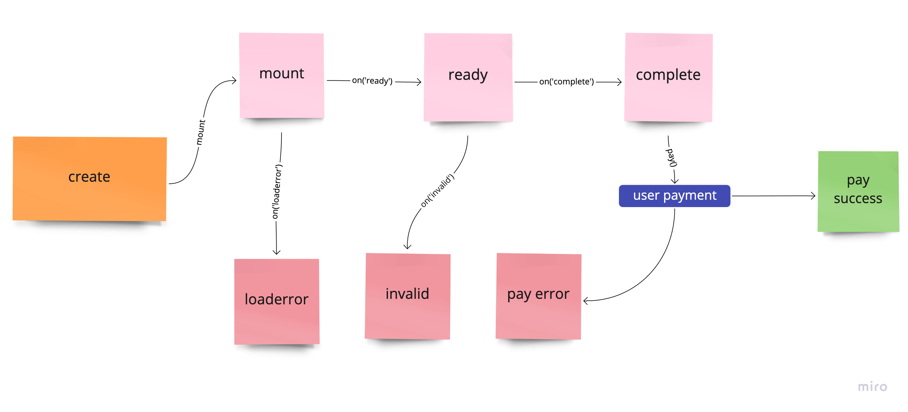
Component Lifecycle
Methods
Mount component
A component can be mounted in DOM containerUpdate component
The values of a component can be updatedUnmount component
To unmount a component from DOM container. Use component.mount to mount againGet component data
To get the data and state of a componentReturns
| Name | Description | Default |
|---|---|---|
value | Contains the value of the component. | {} |
error | Contains error that has occurred in the component | undefined |
message | Contains any message that can be shown to the customer | {} |
invalid | Is true is the component is invalid | undefined |
empty | Is true if the component is empty | false |
complete | Is true if the component is complete | false |
ready | Is true if the component is ready for user input | false |
componentName | Contains the type of the component | componentName |
node | Contains the reference to the parent of the component | null |
mounted | Is true if the component has been mounted | false |
Blur component
Trigger blur on component. Can only be applied ifkind of the component is input
Focus component
Trigger focus on component. Can only be applied ifkind of the component is input
Clear component
Trigger clear on component to empty it. Can only be applied ifkind of the component is input
Click component
Trigger click on component. Can only be applied ifkind of the component is button
Disable component
Disabling component will apply theclasses.disabled and style.base[":disabled"] or style.empty[":disabled"] to the container and compoent respectively. Can be applied to input and button
Enable component
To enable a disabled component. Can be applied toinput and button
Destroy component
To destroy a component. Once a component is destroyed it cannot be mounted againEvents
You can register a callback function to various events that occur with a component. The basic syntax iscomponent.on(eventName, callBackFunction)
ready
Triggers when a component is ready for user interactionfocus
Triggers on componentkind input when focussed
blur
Triggers on componentkind input when blurred
invalid
Triggers on componentkind input when value entered by the user is invalid. Callback receives object that has the error. Read more about error here
change
Triggers on componentkind input whenever change happens for the value
empty
Triggers on componentkind input when empty
complete
Triggers on componentkind input when value entered is complete and valid
click
Triggers on componentkind button when clicked